Making data visualization more accessible for blind and low-vision individuals

By Adam Zewe | MIT News Office
Data visualizations on the web are largely inaccessible for blind and low-vision individuals who use screen readers, an assistive technology that reads on-screen elements as text-to-speech. This excludes millions of people from the opportunity to probe and interpret insights that are often presented through charts, such as election results, health statistics, and economic indicators.
When a designer attempts to make a visualization accessible, best practices call for including a few sentences of text that describe the chart and a link to the underlying data table — a far cry from the rich reading experience available to sighted users.
 An interdisciplinary team of researchers from MIT and elsewhere is striving to create screen-reader-friendly data visualizations that offer a similarly rich experience. They prototyped several visualization structures that provide text descriptions at varying levels of detail, enabling a screen-reader user to drill down from high-level data to more detailed information using just a few keystrokes.
The MIT team embarked on an iterative co-design process with collaborator Daniel Hajas, a researcher at University College London who works with the Global Disability Innovation Hub and lost his sight at age 16. They collaborated to develop prototypes and ran a detailed user study with blind and low-vision individuals to gather feedback.
“Researchers might see some connections between problems and be aware of potential solutions, but very often they miss it by a little bit. Insights from people who have the lived experience of a certain specific, measurable problem are really important for a lot of disability-related solutions. I think we found a really nice fit,” says Hajas.
They created a framework to help designers think systematically about how to develop accessible visualizations. In the future, they plan to use their prototypes and design framework to build a user-friendly tool that could convert visualizations into accessible formats.
MIT collaborators include co-lead authors and Computer Science and Artificial Intelligence Laboratory (CSAIL) graduate students Jonathan Zong, Crystal Lee, and Alan Lundgard, as well as JiWoong Jang, an undergraduate at Carnegie Mellon University who worked on this project during MIT’s Summer Research Program (MSRP), and senior author Arvind Satyanarayan, assistant professor of computer science who leads the Visualization Group in CSAIL. The research paper, which will be presented at the Eurographics Conference on Visualization, won a best paper honorable mention award.
“Push what is possible”
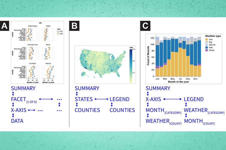
The researchers defined three design dimensions as key to making accessible visualizations: structure, navigation, and description. Structure involves arranging the information into a hierarchy. Navigation refers to how the user moves through different levels of detail. Description is how the information is spoken, including how much information is conveyed.
Using these design dimensions, they developed several visualization prototypes that emphasized ease-of-navigation for screen-reader users. One prototype, known as multiview, enabled individuals to use the up and down arrows to navigate between different levels of information (like the chart title as the top level, the legend as the second level, etc.), and the right and left arrow keys to cycle through information on the same level (such as adjacent scatterplots). Another prototype, known as target, included the same arrow key navigation but also a drop-down menu of key chart locations so the user could quickly jump to an area of interest.
“Our goal is not just to work within existing standards to make them serviceable. We really set out to do grounded speculation and imagine where we can push what is possible with these existing standards. We didn’t want to limit ourselves to refitting tools that were designed for images,” says Zong.
They tested these prototypes and an accessible data table, the existing best practice for accessible visualizations, with 13 blind and visually impaired screen-reader users. They asked users to rate each tool on several criteria, including how easy it was to learn and how easy it was to locate data or answer questions.
“One thing I thought was really interesting was how much people were constantly testing their own hypotheses or trying to make specific patterns as they moved through the visualization. The implication for navigation is that you want to be able to orient yourself within the visualization so you know where the limits are,” says Lee. “Can you accurately and easily know where the walls are in the room you are exploring?”
Improved insights
Users said both prototypes enabled them to more rapidly identify patterns in the data. Scrolling from a high level to deeper levels of information helped them gain insights more easily than when browsing the data table, they said. They also enjoyed faster navigation using the menu in the target prototype.
But the data table got top marks for ease of use.
“I expected people to be disappointed with the everyday tools when compared to the new prototypes, but they still clung to the data table a bit, likely because of their familiarity with it. That shows that principles like familiarity, learnability, and usability still matter. No matter how ‘good’ our new invention is, if it is not easy enough to learn, people might stick with an older version,” Hajas says.
Drawing on these insights, the researchers are refining the prototypes and using them to build a software package that can be used with existing design tools to give visualizations an accessible, navigable structure.
They also want to explore multimodal solutions. Some study participants used different devices together, like screen readers and braille displays, or data sonification tools that convey information using non-speech audio. How these tools can complement each other when applied to a visualization is still an open question, Zong says.
In the long-run, they hope their work might lead to careful rethinking of web accessibility standards.
“There is no one-size-fits-all solution for accessibility. While existing standards don’t presume that, they only offer simple approaches, like data tables and alt text. One of the key benefits of our research contribution is that we are proposing a framework — different preferences and data representations are situated at different points in this design space,” says Lundgard.
“We have been working hard toward reducing the inequities that screen-reader users face when extracting information from online data visualizations for the past few years. So, we are really appreciative of this work and the knowledge that it adds to the existing literature,” says Ather Sharif, a graduate student who researches accessibility and visualization in the labs of professors Jacob Wobbrock and Katharina Reinecke at the Paul G. Allen School of Computer Science and Engineering of the University of Washington at Seattle, and who was not involved with this work.
“I like to think of it as a movement where we’re all finally coming together and improving the experiences of a demographic that has been largely ignored, especially when presenting data through visualizations. Kudos to Jonathan, Arvind, and their team for this insightful and timely work! I am looking forward to what’s next,” adds Sharif, who is lead author of several recent papers related to accessible data visualizations.
Amy Bower, a senior scientist in the Department of Physical Oceanography at the Woods Hole Oceanographic Institution who suffers from a degenerative retinal disease and uses a screen reader extensively in her work as a researcher and also for basic living tasks, found the researchers’ explanations of the importance of co-design to be powerful and compelling.
“As a blind scientist, I’m constantly searching for effective tools that will allow me to access the information conveyed in data visualizations. The layered approach taken by these researchers, which provides the option to get the ‘big picture’ from the data as well as drill down into the data points themselves, allows the user to choose how they want to explore the data,” says Bower, who also was not involved with this work. “I think the ability to freely explore the data is necessary not just to learn the ‘story’ that the data are telling, but to allow a blind researcher such as myself to formulate the next questions that need to be tackled to advance understanding in any field of study.”
This work was supported, in part, by the National Science Foundation.

