Are Your Emojis Accessible?

Repost from AT3 Center News & Tips
The California AT Act Program, Ability Tools, is writing a useful blog series focused on social media and accessibility. One post advises users with disabilities on best ways to access Facebook–a refreshing point of view that also serves to raise awareness for all with the added benefit of placing the nondisabled reader in, for example, a blind user’s shoes. (Check out Social Media Accessibility Tips & Tricks: Facebook.) Another post, directed at all users, provides advice on accessible posting across social media platforms. It reminds users to remember things like plain language, avoiding flashing gifs, resisting all caps, etc.
And then way down this list comes this recommendation:
Avoid emoticons, whenever possible. When a screen reader encounters an emoticon, it has difficulty understanding and conveying the meaning behind the series of text characters. Rather, use emojis, as when a screen reader encounters an emoji, it reads the assigned meaning of the emoji to the person using the screen reader. For example, a thumbs-up emoji might read as ‘Thumbs-up” to someone using a screen reader.
What?? First of all, what is the difference between an emoticon and an emoji? And what are the accessibility implications of this ignorance? AT3 Center News and Tips wanted to know (and pass this 21st C. wisdom along to our readers)!
Emojis
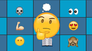
Emojis are, of course, those little faces and other symbols that are used everywhere, from texting and email to social media. These, it turns out, are baked with alt text. When a screen reader confronts them, that alt text–invisible to the writer–is read aloud. As a result, emojis are a better option than…
Emoticons
Here’s where some of us get snagged (“emoticon”?) Emoticons are not graphics with embedded alt text. They are clever constructions made from punctuation and other symbols that convey emotion. For example, the home-grown-on-your-typewriter smiley face made of a colon and a closed parenthesis.
Email platforms may convert these to emojis for you. (WordPress wanted to, so the set above is an image.) That’s probably a good thing. No screen reader user need hear “colon closed parenthesis.” It turns out there are a lot of emoticons that are hold overs from the days before emojis. Avoid them. That creative technology moment is over. But do review them, and how they are different around the world, at this Wikipedia page. (There’s even one for John Lennon: / /0‑0\ \. Admittedly, this is a portrait, not an emoticon per se, but it seems worth sharing.)
Emoji Best Practices
Just because emojis come with alt text doesn’t mean you can use them willy-nilly. Think before you emoji. An Easterseals blog post on this topic by Beth Finke–who is blind–begins this way:
A friend sent me a text the other day that said this: “Wishing you a prosperous new year excited face with money symbols for eyes and stuck-out tongue excited face with money symbols for eyes and stuck-out tongue excited face with money symbols for eyes and stuck-out tongue excited face with money symbols for eyes and stuck-out tongue. You guys free tonight? Give me a call.”
She never made it to the part where she was supposed to give them a call because of all the emojis in the way.
Instead…
- Resist using more than one or two emojis in your message.
- Place your emoji at the end of your message, never in the middle, and never in place of a word.
- Never place an emoji before a “call to action” or purpose of the message (again, they go last).
- Choose emojis that are well understood by all or keep in mind your audience. Avoid ambiguity. (Prayer hands mean thank you? Or pray?)
- As with text, consider adequate contrast of the emoji you choose against its background. Remember your message may be read in either dark or light modes. (Yellow is safe.)
It’s a curious thing, after years of inaccessible graphics, to have arrived at a moment where little tiny cartoons are more accessible than messages created by text, but that is the upshot of emojis vs. emoticons. Progress! Emojis win.

